Overview
During my internship at NYX Vape from March to April 2026, I worked as a Junior Graphic Designer alongside the creative director. In this role, I contributed a range of deliverables including in-store posters, website banners, and a redesigned newsletter template.
I also conducted thorough usability testing of their website across both desktop and mobile platforms, documenting functionality issues and providing UI/UX recommendations.
I also conducted thorough usability testing of their website across both desktop and mobile platforms, documenting functionality issues and providing UI/UX recommendations.
Poster Template
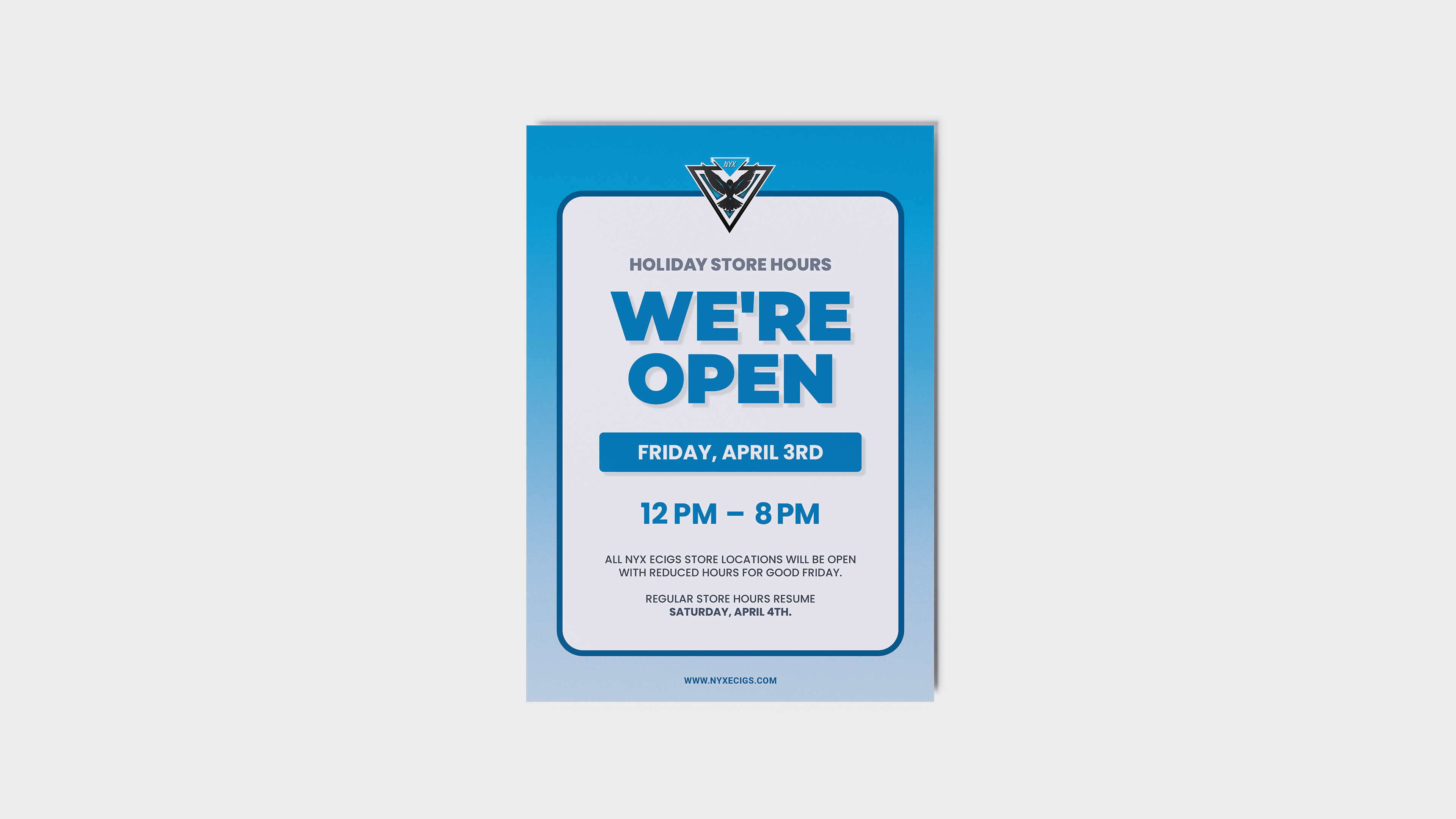
I created a reusable store‑hours poster template for in-store locations to communicate holiday operating times. This project allowed me to strengthen my skills in colour selection, typography, layout hierarchy, and paragraph alignment while ensuring the design remained functional and visually clear.
Because the poster was intended for print, I worked in CMYK to achieve accurate colour reproduction and avoid unexpected darkening. I also paid close attention to text sizing and legibility, ensuring the information was easy to read at a glance and not compromised by overly small type.
Because the poster was intended for print, I worked in CMYK to achieve accurate colour reproduction and avoid unexpected darkening. I also paid close attention to text sizing and legibility, ensuring the information was easy to read at a glance and not compromised by overly small type.
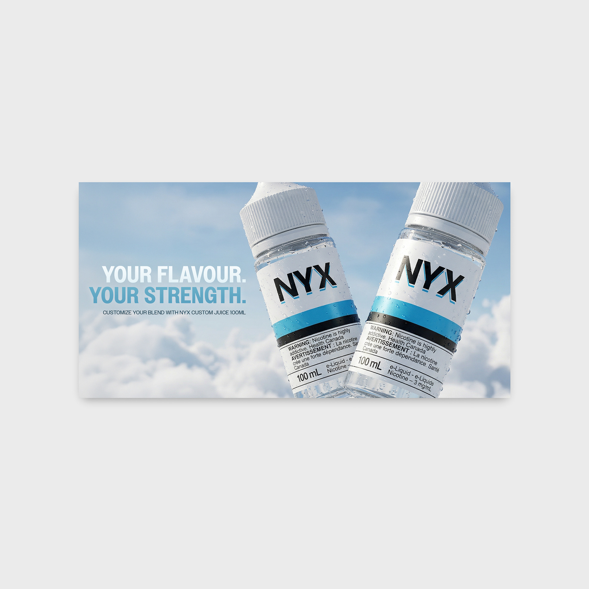
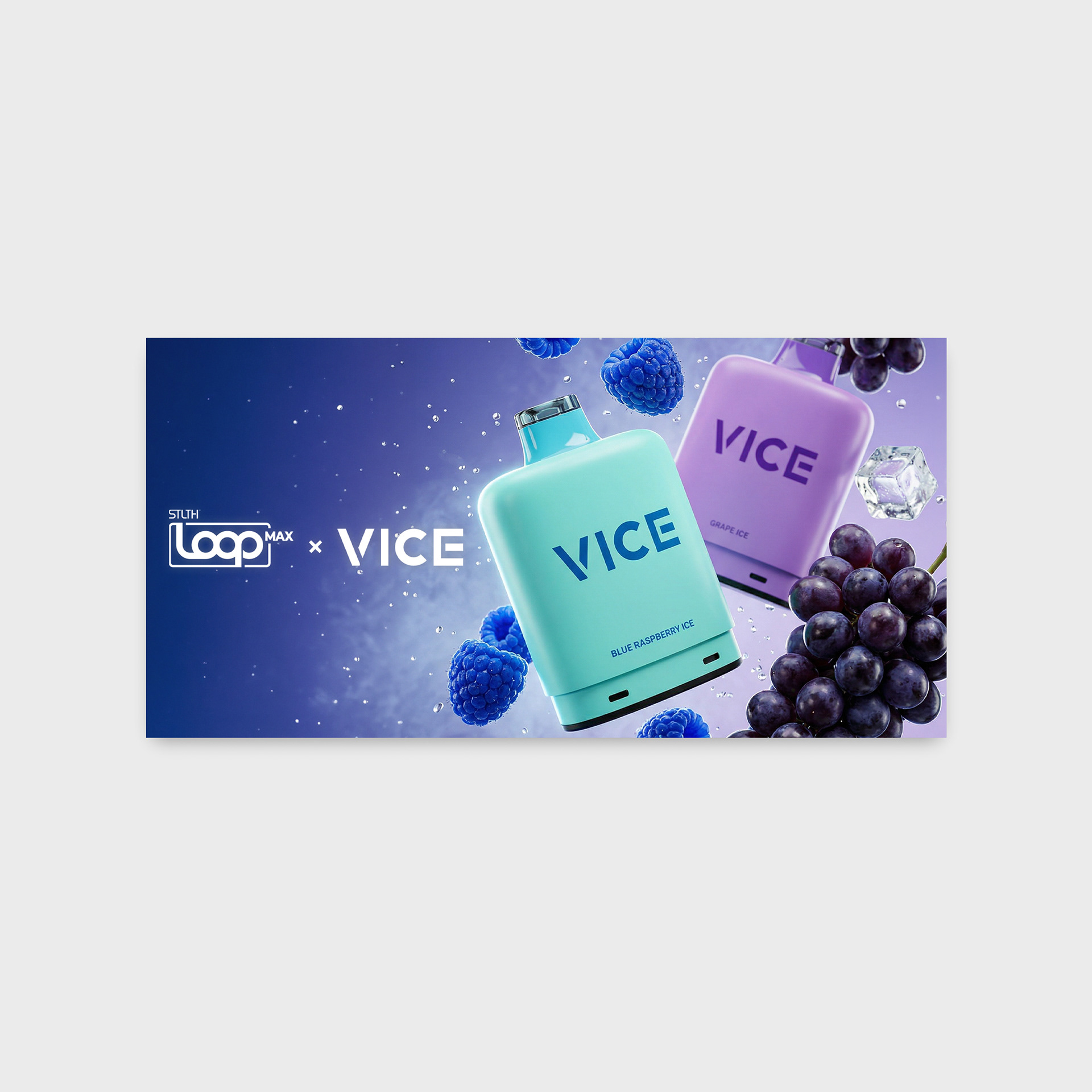
Website Banners
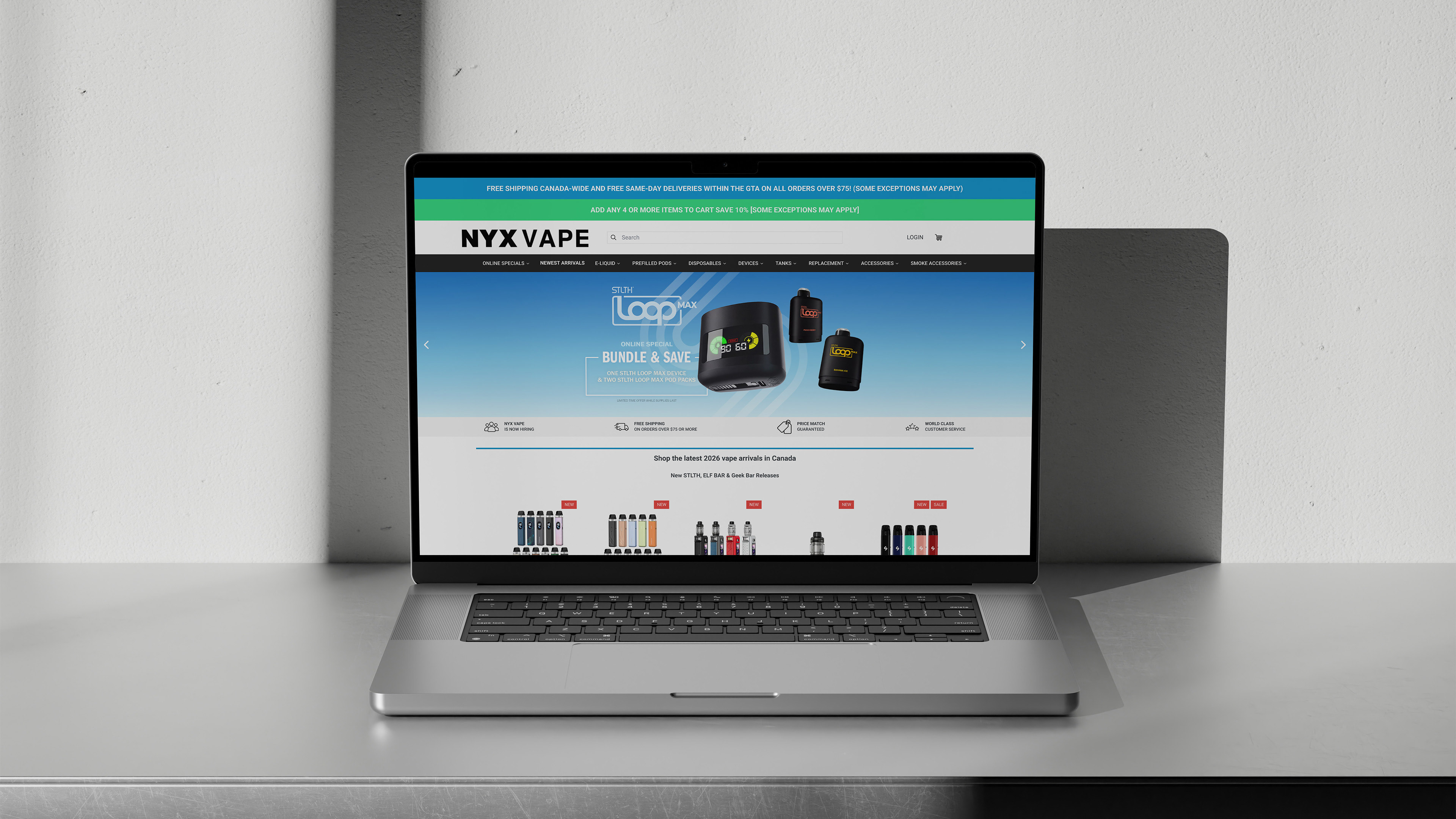
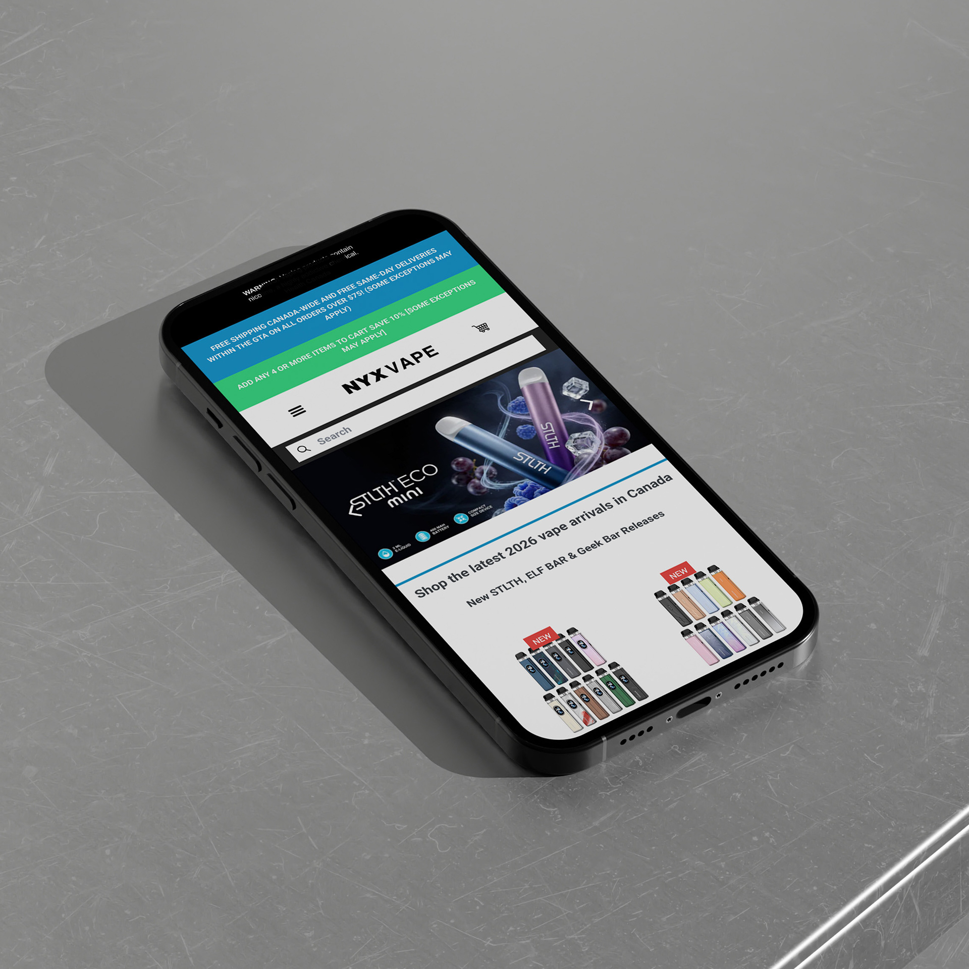
I designed a series of promotional banners for nyxecigs.com, focusing on clean, structured layouts using grid systems and intentional colour contrast to make key elements stand out.
One area that required particular attention was optimizing the designs across different viewports. Working within fixed size constraints meant carefully adjusting spacing and composition, especially on mobile, where the narrower width made layout decisions more challenging.
One area that required particular attention was optimizing the designs across different viewports. Working within fixed size constraints meant carefully adjusting spacing and composition, especially on mobile, where the narrower width made layout decisions more challenging.
UI/UX Suggestions
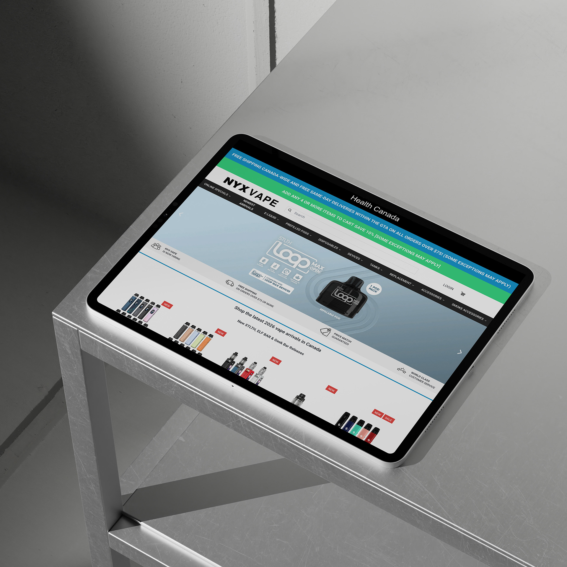
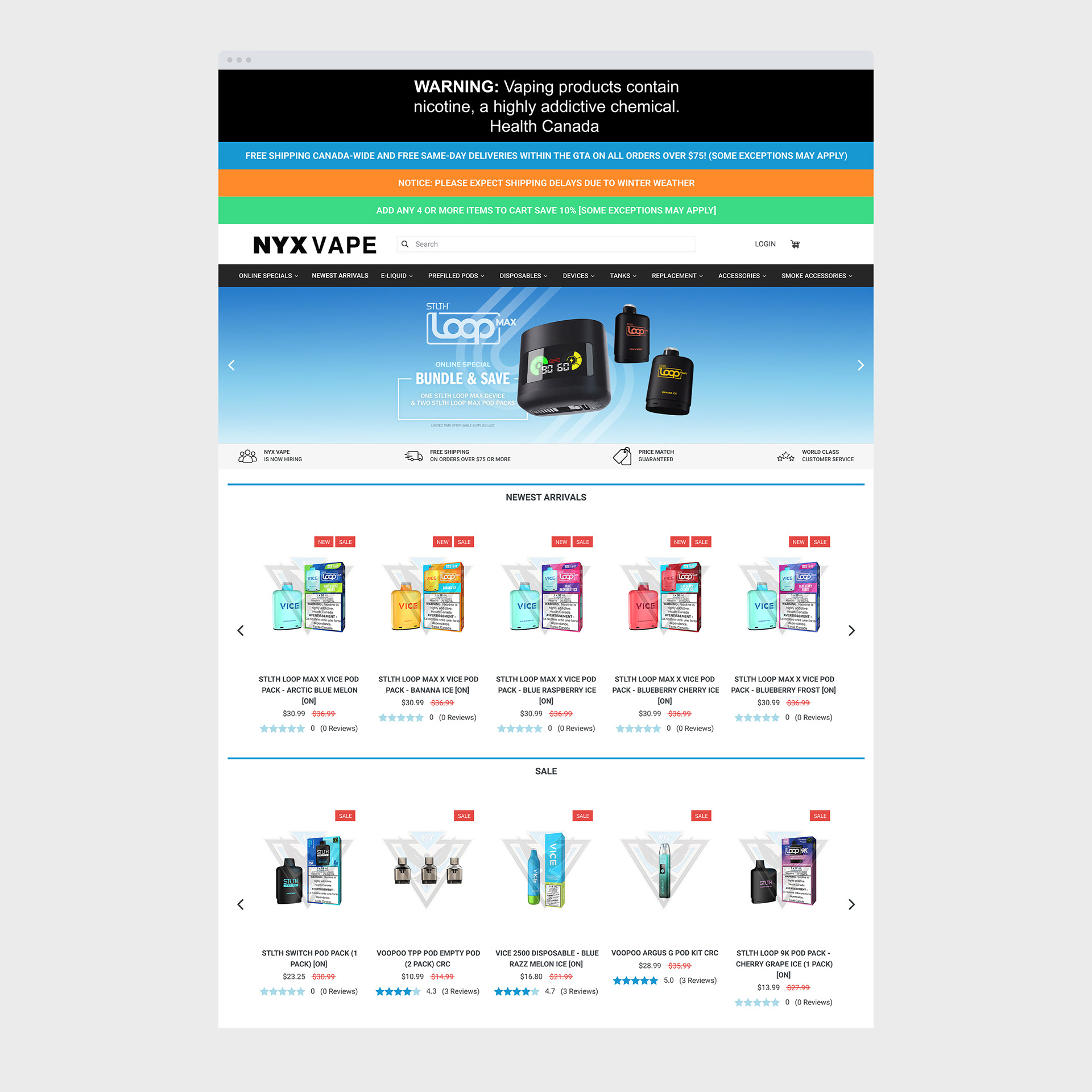
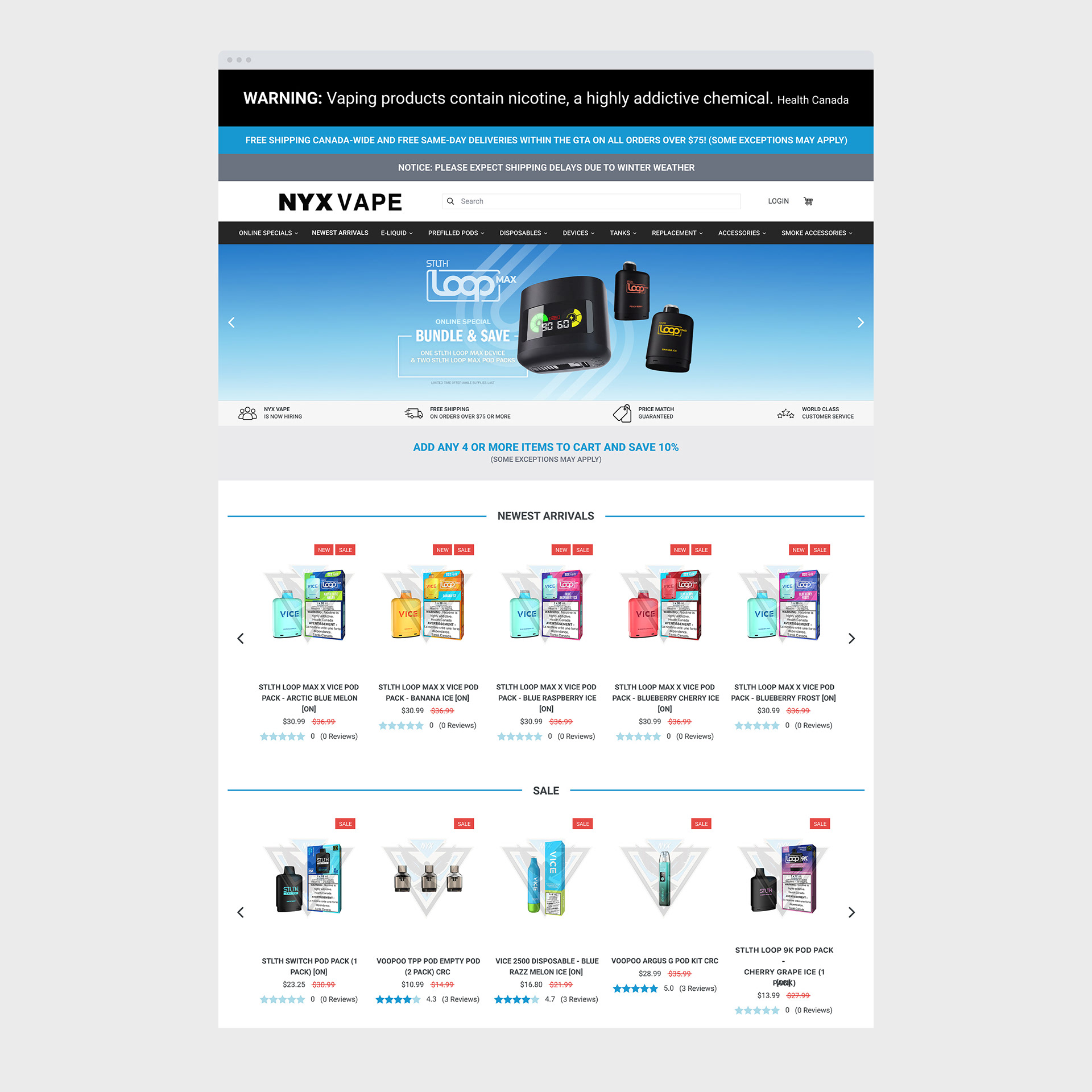
While testing for functionality issues, I found several opportunities to improve the UI and developed recommendations to address them. On the left is the current homepage design, and on the right are my suggestions. To reduce visual clutter, I moved the promotional announcement bar into its own dedicated section. I've also made minor aesthetic refinements to better reflect the company's visual identity.
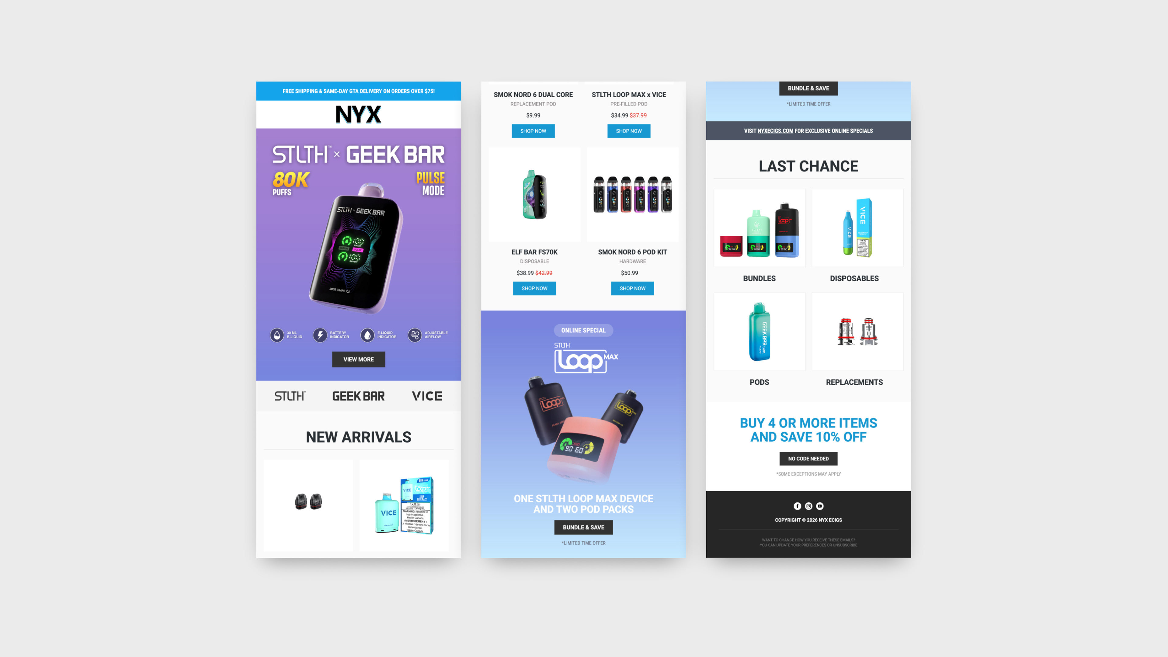
Newsletter Template
My final task was to recreate the company's email newsletter templates using Mailchimp's drag-and-drop builder, something I had never used or done before. Since the project required little to no coding, I had to learn the platform as I went and figure out what tools were available to me. I started by sketching out rough drafts in Figma to get a feel for the layout and direction, then came across Designmodo and found it was a better fit for mocking up the designs.
Once I moved into Mailchimp, I ran into my first real challenge: the custom fonts I had chosen weren't supported by the platform. It was a bit of a setback, but I worked through it by switching to web-safe fonts and adjusting the design so it still felt on par with the brand. I also ensured the final template looked good across different devices.
Looking back, the biggest thing I took away from this project was the importance of researching your tools before jumping into the design process. Had I understood Mailchimp's limitations from the start, I could have avoided some of the back-and-forth revisions. It's a lesson I'll definitely carry with me into future projects.