Overview
The difficulty of managing parking tickets and fines drove me to create a solution. With court dates often taking months or even years to be assigned, violations are easily forgotten until a notice arrives by mail or email. My research revealed a clear gap, Toronto has no dedicated smartphone apps for ticket management.
Problem
Without proper tracking, people can easily miss deadlines and lose track of violations, leading to costly errors. When left unresolved, fines increase, licenses get suspended, and legal problems pile up.
Solution
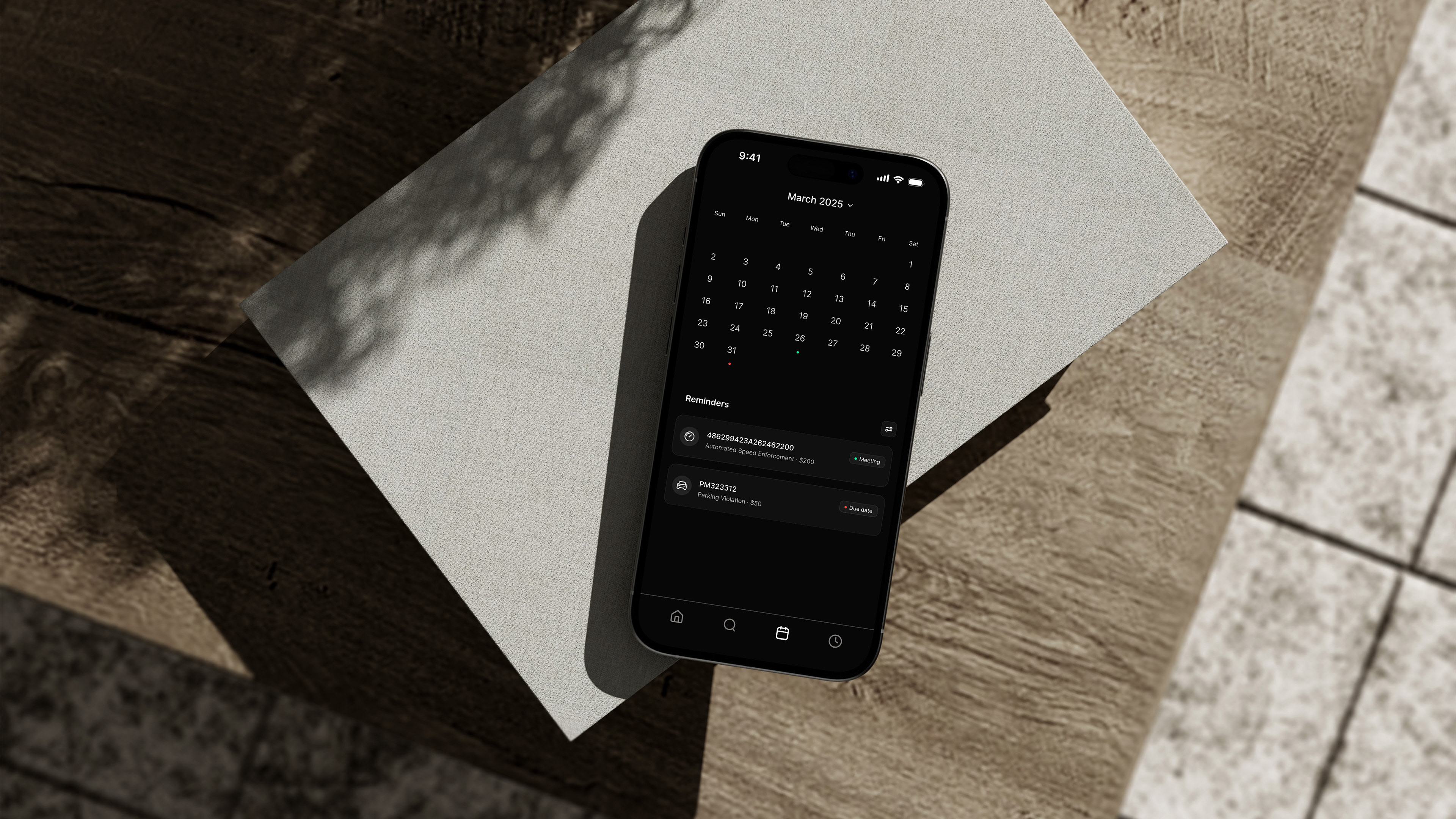
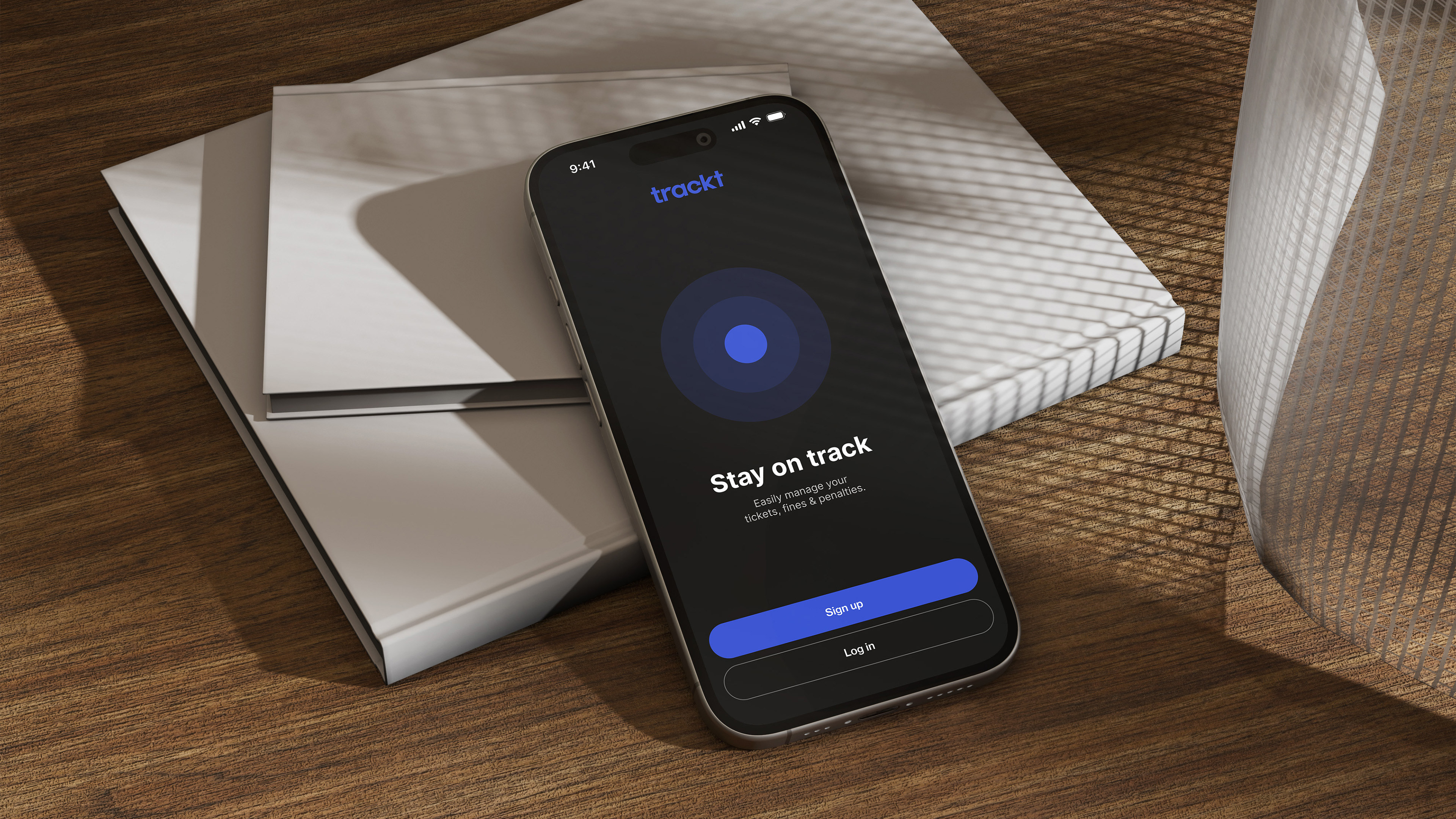
I designed trackt, a mobile app that gives users one convenient place to manage and organize their parking violations, citations, and fees. Users can easily track tickets, monitor outstanding payments, and stay on top of their financial responsibilities.
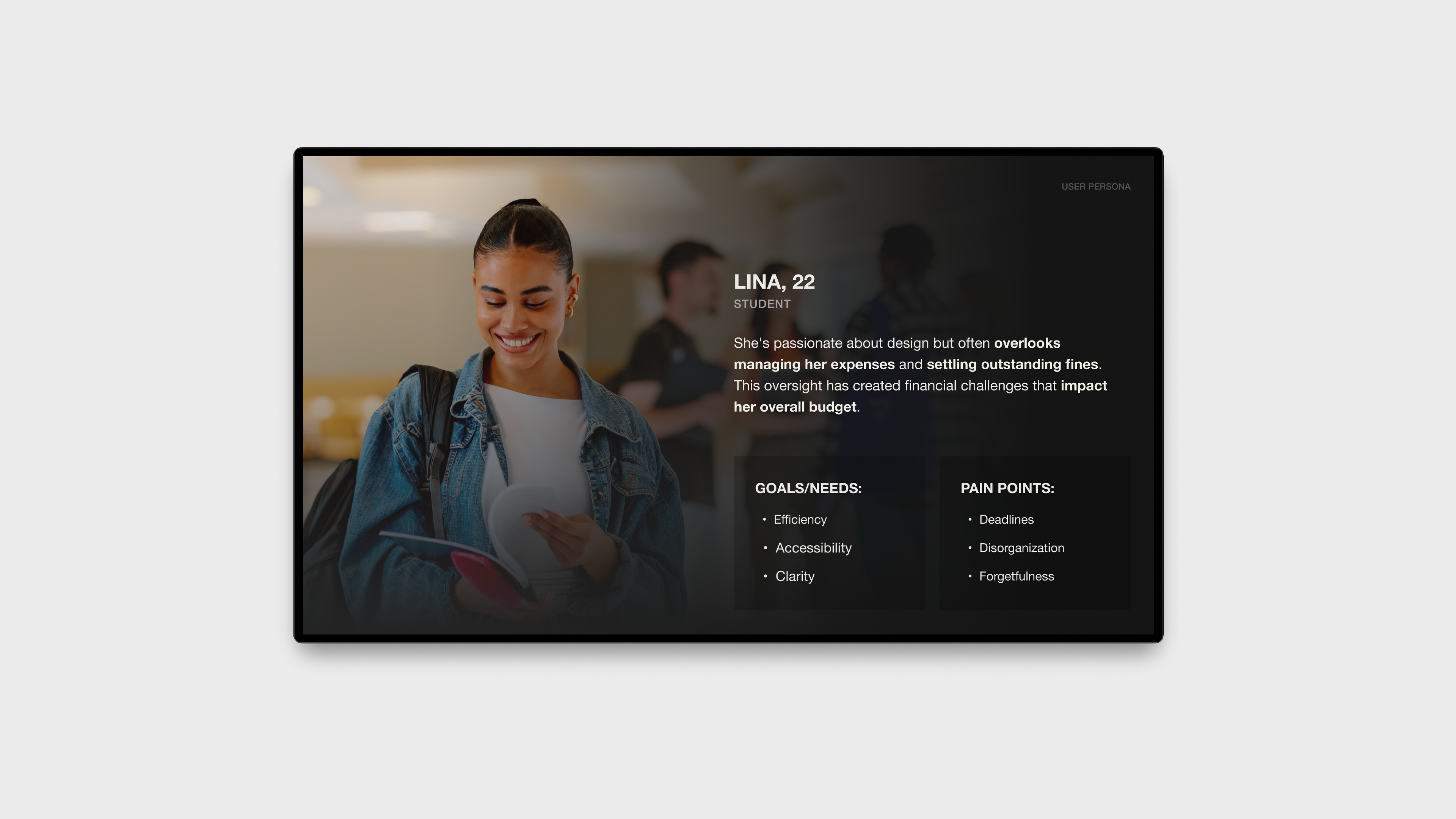
User Persona
I created a user persona to understand who I'm designing for and what they actually need. By identifying their frustrations and goals, I can build solutions that put the user's experience first.
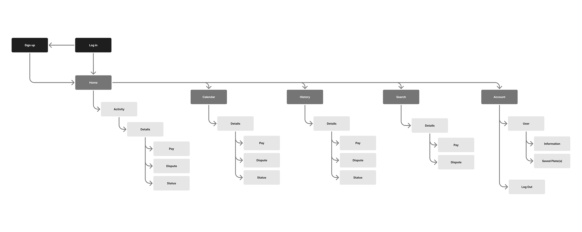
Sitemap
I created a sitemap defining the app's structure and navigation flow to optimize usability and user experience.
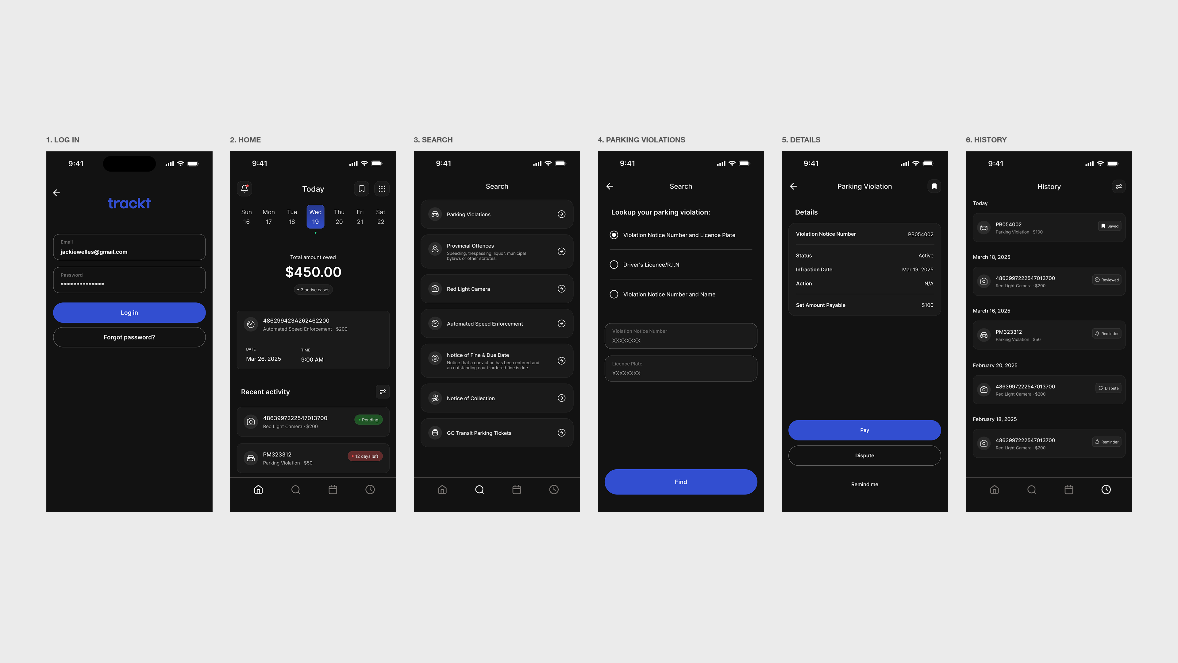
Userflow
The user flow guides users through login, violation search, case details, and the option to bookmark or set reminders for notifications. This approach eliminated clutter and prioritized simple navigation, making sure each feature is easy to find and understand.
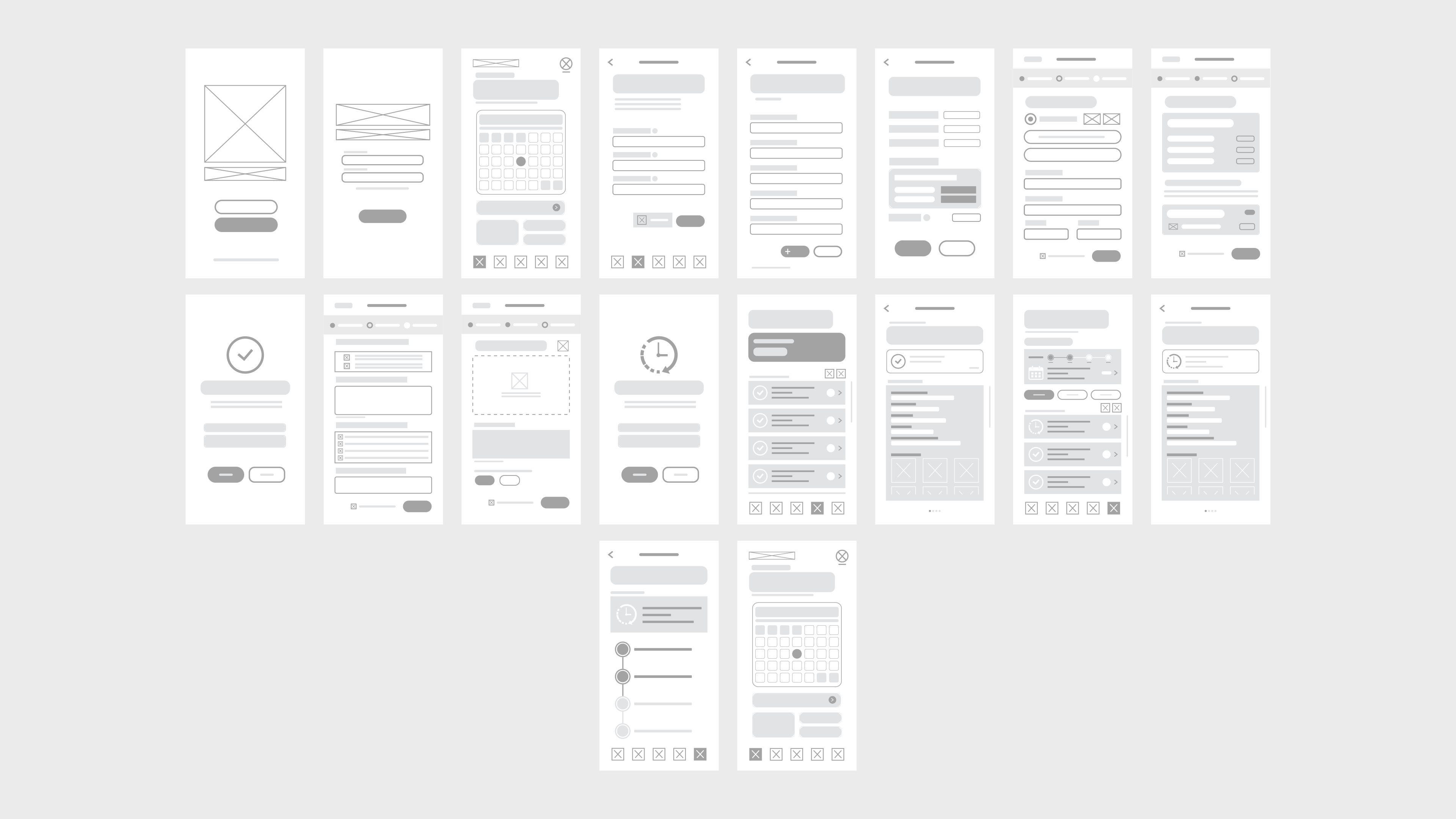
Wireframes
Sketching out the wireframes helped me nail down the app's layout and make sure it was straightforward. By working through the structure early, I caught issues before they became problems and refined the design into something that really works for users.
Onboarding
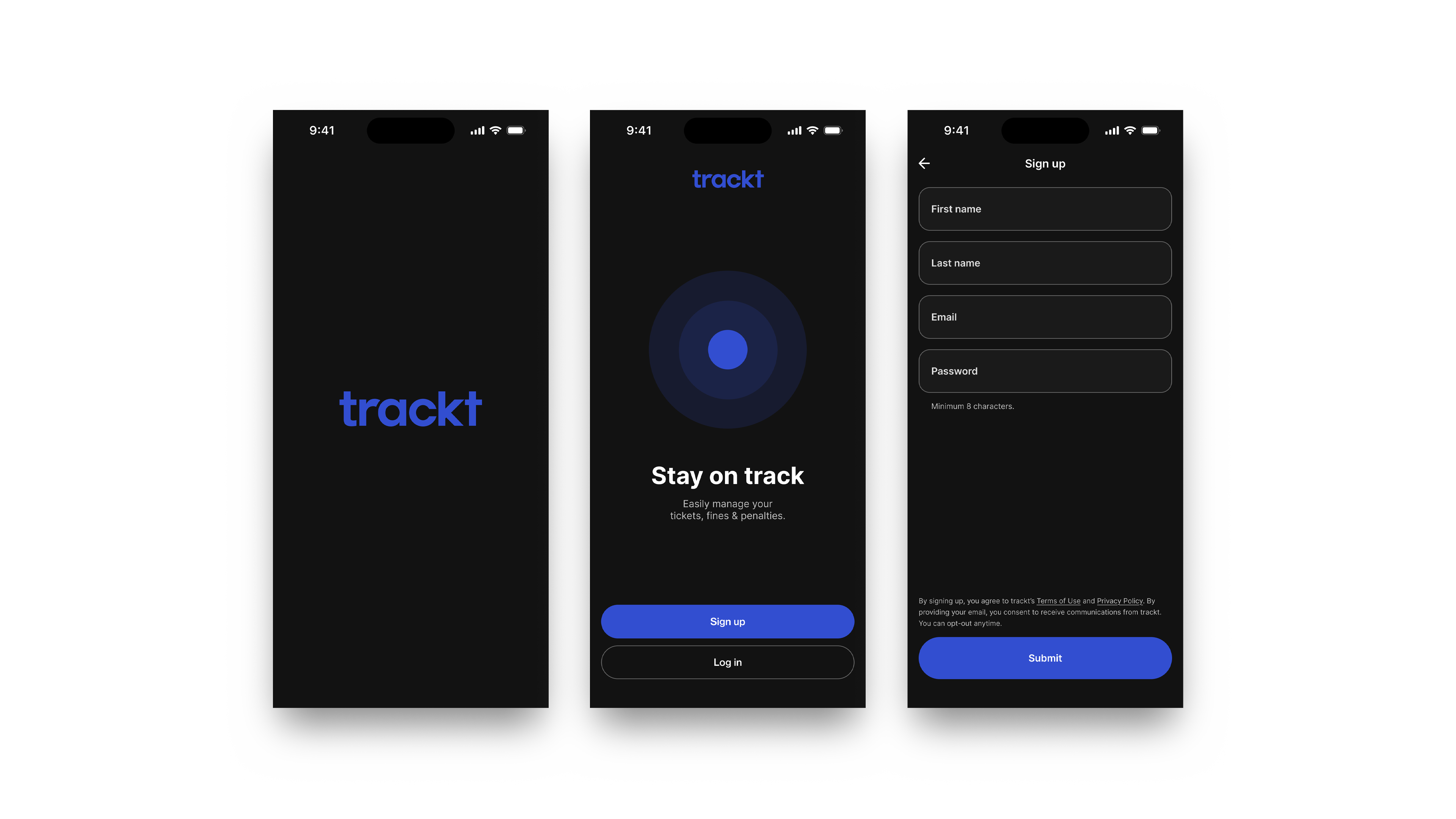
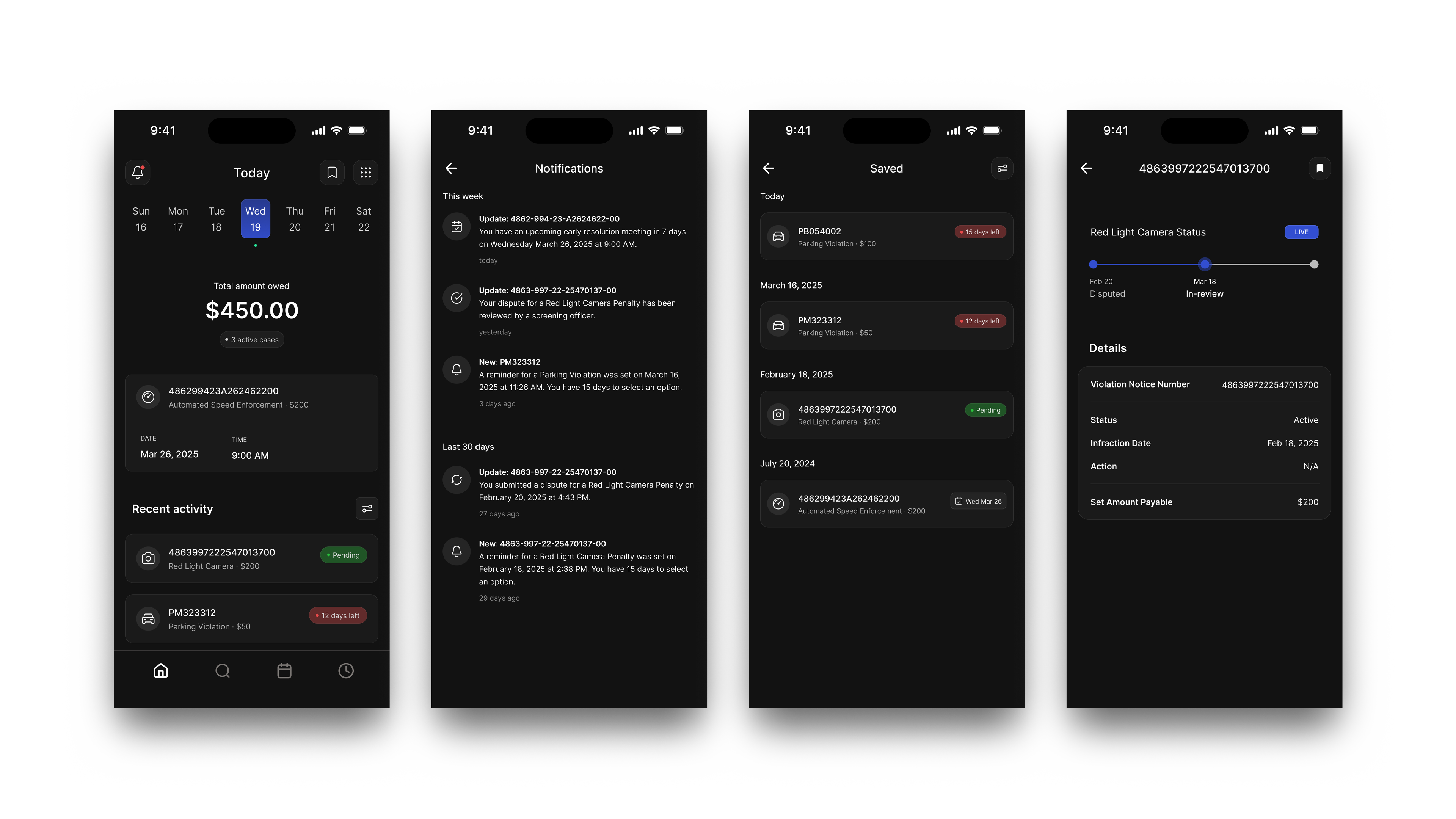
Main Flow
Usability Testing
Prototype testing with peers confirmed the design's effectiveness, though feedback revealed opportunities for improvement. A key recommendation was adding icons to search bars for better visual guidance. These refinements improved accessibility by designing with inclusivity in mind.
Adjustments
I brought the payments and disputes pages together under the history section and restructured the layouts to make everything easier to navigate. This gives users a single destination to track and manage all their cases, whether active or resolved.
Final Designs
The final design balances minimalism with strong user experience, focusing on both visual clarity and usability. Through iterative feedback and testing, I created a solution that truly serves users while meeting the project's objectives.